Sober Attraction
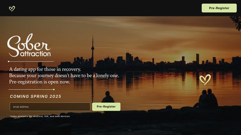
A brand for a new app supporting people in addiction recovery. Warm and human, built around love and connection instead of labels.
case study 1 of 5. the other four are coming
- Lead designer and art director
- 4 people
- 3 months
- Brand strategy, visual identity, brand guidelines
- Avocado Toast Studio
Overview
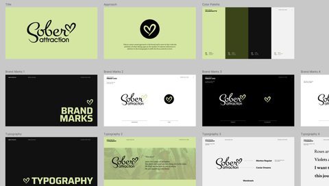
An entrepreneur approached us to develop the brand for a new app supporting individuals in addiction recovery. The scope included brand strategy, visual identity, and comprehensive brand guidelines: all crafted to reflect care, clarity, and human connection from the ground up.
Challenge
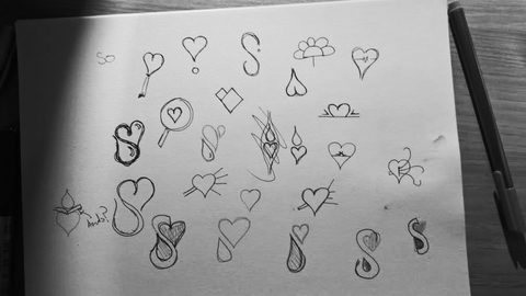
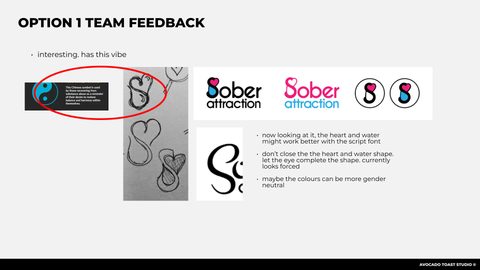
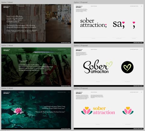
The brand needed to avoid the heavy tone often associated with addiction recovery, without leaning too hard into optimistic tropes like “growth.” We explored three distinct directions, each carefully designed to balance empathy and empowerment. The final identity reflected the client’s vision: honest, uplifting, and grounded.
Approach
Most recovery-related apps take a clinical or overly serious tone. We chose a different path; casual, warm, and human. The brand centered around love and connection, not labels or past struggles. We focused on representing users as whole people, not just their recovery journey.
Outcome
The final brand identity was met with enthusiasm by the client and early stakeholders. It gave them the tools to clearly communicate their mission, present a polished face to partners, and move forward with app development and marketing with confidence.